Team Travel Management Logo
Details
Who: Team Destination Management
Year: 2019
Category: Sports travel
Services: Logo design | Illustrator
Description
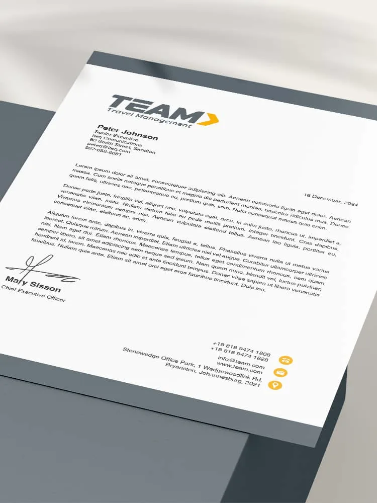
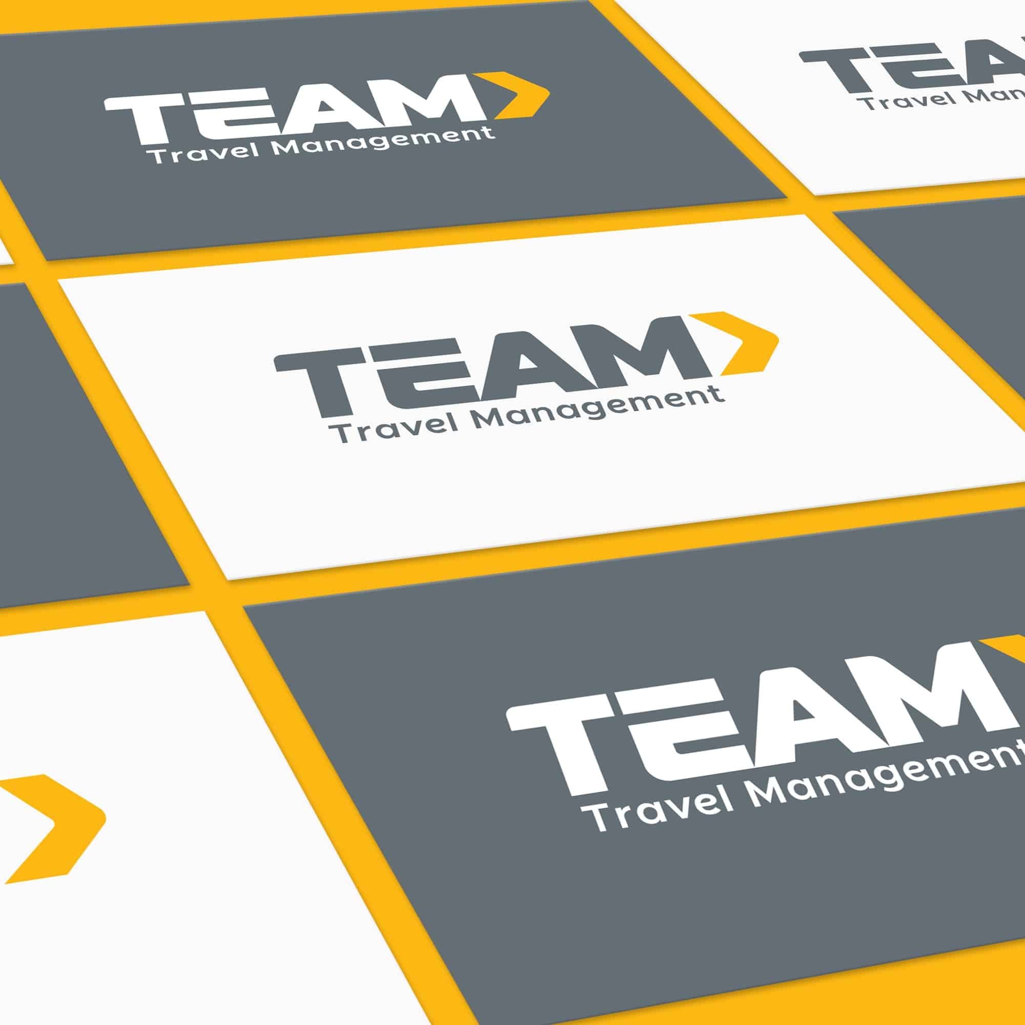
TEAM Travel Management, a global destination management company targeting the business-to-business segment in sports travel, required a logo redesign. The company was rebranding from TEAM Sports Travel to TEAM Travel Management, and the new logo needed to be memorable and timeless.
The previous logo was outdated and had problems when applied to various media, such as embroidered caps or T-shirts. The new logo needed to correspond to a modern and dynamic brand. It must also be ergonomic for easy use across various media, from embroidery to digital applications.
The font in TEAM has been custom-created for the logo. It is a geometric sans-serif font inspired by Futura and Gotham to make the logo memorable and timeless. I rounded the logo’s edges to elicit friendly and human qualities.
The font and styling of the letters are meant to convey a dynamic quality. The italics give a sense of movement and fun. The arrow at the end simultaneously reinforces ideas of movement and progression. It is intended to represent the concept of movement as in going travelling, whereas the progression part represents the idea of a modern, dynamic, and forward-thinking brand.
A “play symbol” is contained in the negative space between the M and the arrow. It represents the notion of play as in the playing of sport. The styling of the E in TEAM is intended to fit in with the idea of a movement of the letters. It also adds unique flair and personality to the design, making the logo distinctive. The lowercase font of “Travel Management” is informal to feel amiable.

